Until a few years ago, simply incorporating a digital sign or two in your retail window display was enough to draw your customers’ attention. But as digital signage has proliferated, the bar has been raised.
One trend we’re seeing is the use of extra-large screens filling the entirety of a window display, or as a backdrop behind featured merchandise stands or mannequins. These are often lower-resolution LEDs that look better from across the street (or mall) than they do up close. This approach can be effective, but there are tradeoffs of pixel pitch, weight, and complexity of installation that need to be managed.
We’re also seeing retailers use multiple LCD screens, in a variety of ways. Let’s explore.
More screens, more interest
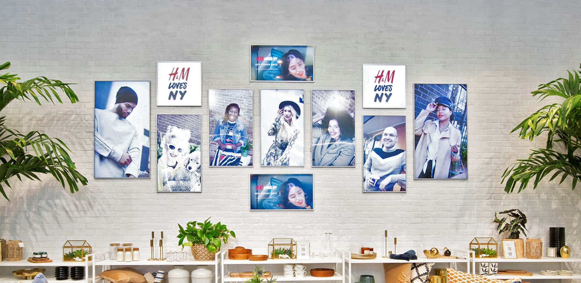
One way to add visual interest is to add multiple screens with artfully varied orientation and composition. We’re seeing retailers use this “gallery wall” approach in compelling ways in both window displays and point of purchase.

As for the content on these screens – stills (or stills that slowly transition) can be more effective than having active video on every screen, which can be visually overwhelming. Interspersing copy-based content with imagery can also improve the overall composition while conveying brand messaging about the retailer, collection or category. If you’re using this approach, restraint is key. Think large type and bold, straight-forward imagery that combines well across the wall

Grids and Walls
Using multiple LCD screens in a closely fitted grid can provide visual impact that draws attention from a distance, but unlike LEDs the image doesn’t fall apart up-close. Most modern signage CMS software enables users to split a video or image across such a grid of identically sized screens in landscape or portrait orientation, however, the software is not always intuitive to use.
When scaling up to full wall size, say 4×4 or higher, ensure the resolution of the source image or video is adequate — if the resolution falls apart up close, you’re wasting a benefit of LCD and may as well have used an LED solution.
Beyond providing the impression of one large screen, using screens in a grid or wall also provides more impact from luminosity and color. A grid of bright screens can illuminate merchandise or traffic areas. It’s important to consider how your merchandise will be look beside such screens, along with the psychological effects of colored light on your customers.
Orchestrated Wall
A more sophisticated and attention-getting approach to video walls is the orchestrated wall. On an orchestrated wall you present a single image or video across any arrangement of screens, not just the standard grid of closely fitted or evenly spaced screens. You might also combine screens in landscape, digital, or square formats. This means a single image or video could be displayed across the gallery wall of screens mentioned earlier. The visual effect is stunning and stops viewers in their tracks.
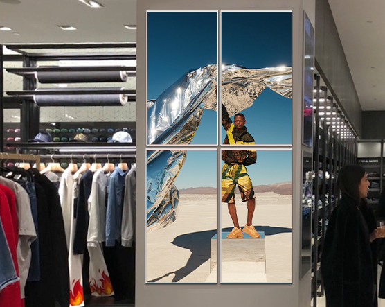
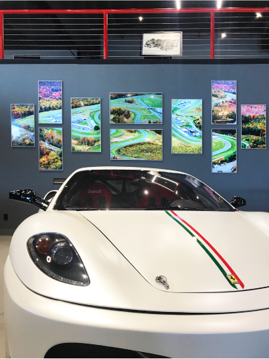
Let’s take a moment to talk about planning and execution of non-standard, non-grid walls. As a retailer, when you’re planning and designing what we’re calling a gallery wall, you want it to look its best and achieve its goal by using different content on every screen. And each screen’s content will be managed individually through a CMS. When planning and designing an orchestrated wall, you’ll envision how a single video or image will look across the array. This is a different mindset that opens up new possibilities, such as arranging screens in a shape that matches your product, perhaps roughly circular or triangular, or an arrangment that fits your logo – the sky’s the limit.
In most CMS systems, this is difficult to impossible. You would need to create x number of videos, split them in pre-production, and sync them across your CMS.
Of all the digital signage solutions we’ve seen, only the Videri Canvas and CMS makes creative orchestrations easy. You simply arrange the Canvases in the layout you like, then take a photo of the arrangement and sync it to the Videri mobile app, saving it as a video wall. Within the Videri CMS, the content you select can now be automatically mapped across the Canvases.
Choosing signage for multiples, grids and Orchestration.
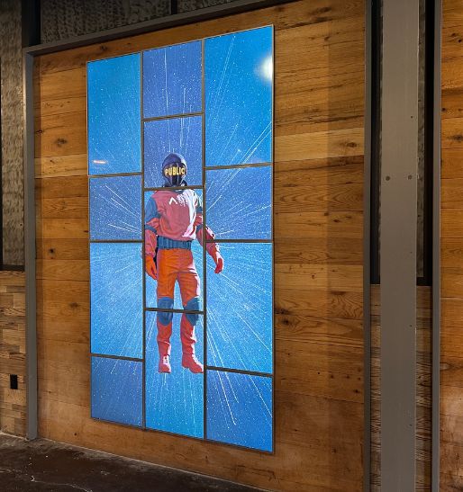
Using multiple screens for digital signage can provide impressive results and ROI. However, the challenges and complexity of conventional signage systems can get in the way. Mounting typical screens can be time-consuming, with mounting brackets that require sturdy walls and/or professional installers. Power draw can be high. Screens of different dimensions and thicknesses can be difficult to align on the same plane. There’s also the dreaded rats’ nest of cables that need to be hidden or bundled, exacerbated by connections to media players, splitters, routers and more.
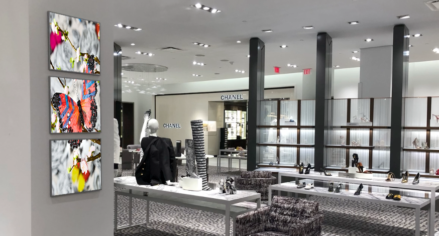
The Videri Canvas is the ideal choice for video walls. They provide a super-slim profile – just 15.5mm (0.61 in) thick – across five sizes of display, with low-profile mounting brackets that are easy to install. Only one thin power cable is required, and the power draw is the lowest in the industry. There’s also no need to worry about a rats’ nest of cables, because the media player is onboard and the Canvas connects to a cloud-based CMS via Wi-Fi. Lastly, the CMS makes it as easy to manage content across an orchestrated, creative arrangement of Canvases as it is across a standard grid
.
If you’re looking to experiment and test a variety of multi-screen window displays, consider the Videri Canvas. Its light weight, thin profile and lack of cables make installation easy, so you can more easily experiment with creative wall layouts. Perhaps most importantly, its intuitive CMS lets you easily orchestrate content across creative, eye-catching layouts.
